We imagine a “Hero User.” This person is sitting at a well-lit desk with a cup of coffee.They have a stable fiber connection. They are fully rested, emotionally regulated, and reading every line of text they see. We callthis the “Happy Path.”
But in the wild, your user is often on the “SleepyPath.”
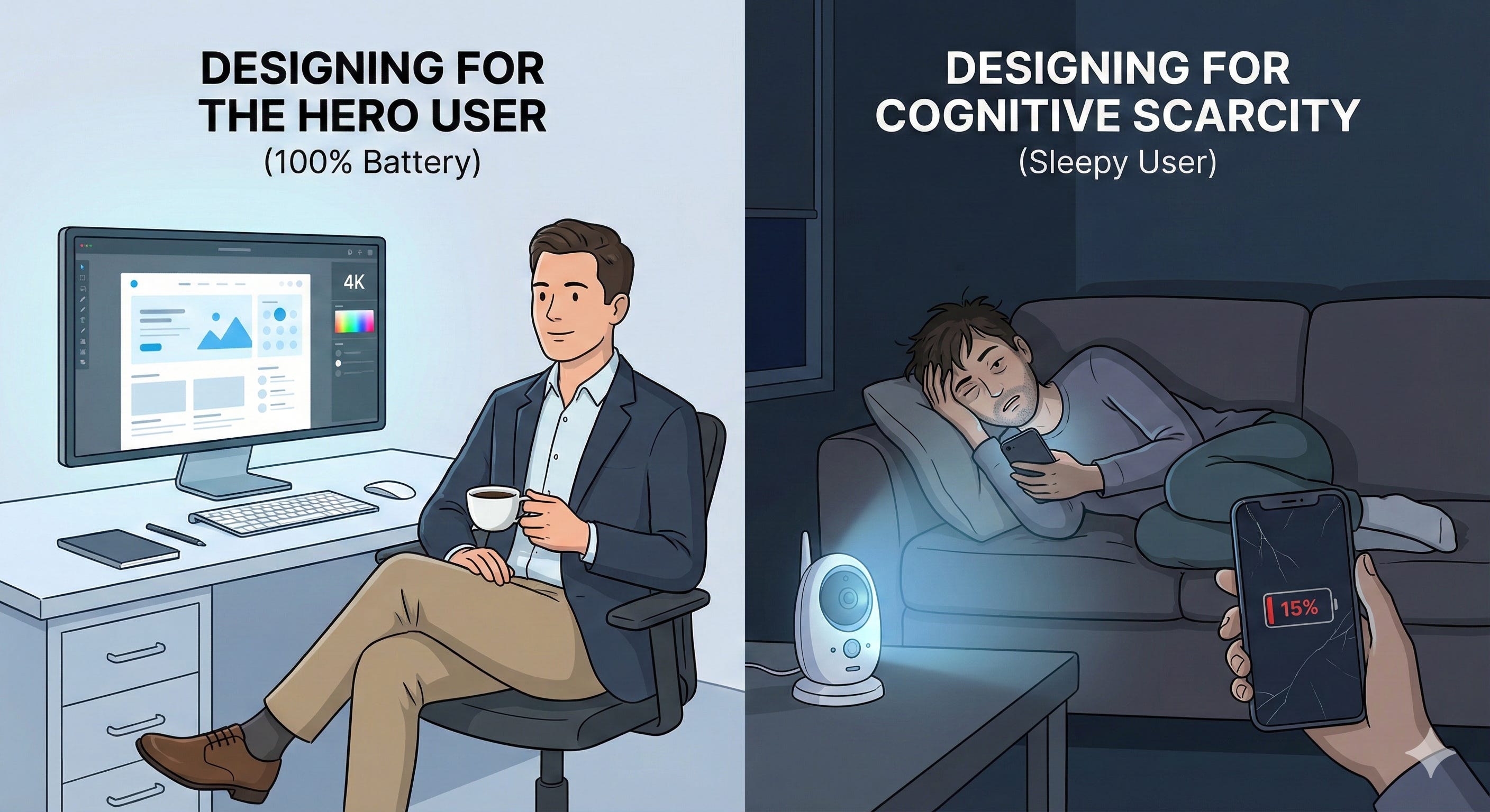
They are operating on 15% battery—biologically and technologically. They are scrollingone-handed while holding a crying baby, standing on a crowded train with spotty signal, or trying to pay a bill at 1:00 AM whilepanicked.
They are in Cognitive Scarcity: a temporary drop in mental bandwidth caused by stress,fatigue, or distraction.
When you design for the Hero User, you build fragility. When you design for the Sleepy User,you build resilience.(note 1)
Here is the difference between a Hostile Interface and a Resilient Interface.
Pattern1: The Session Timeout
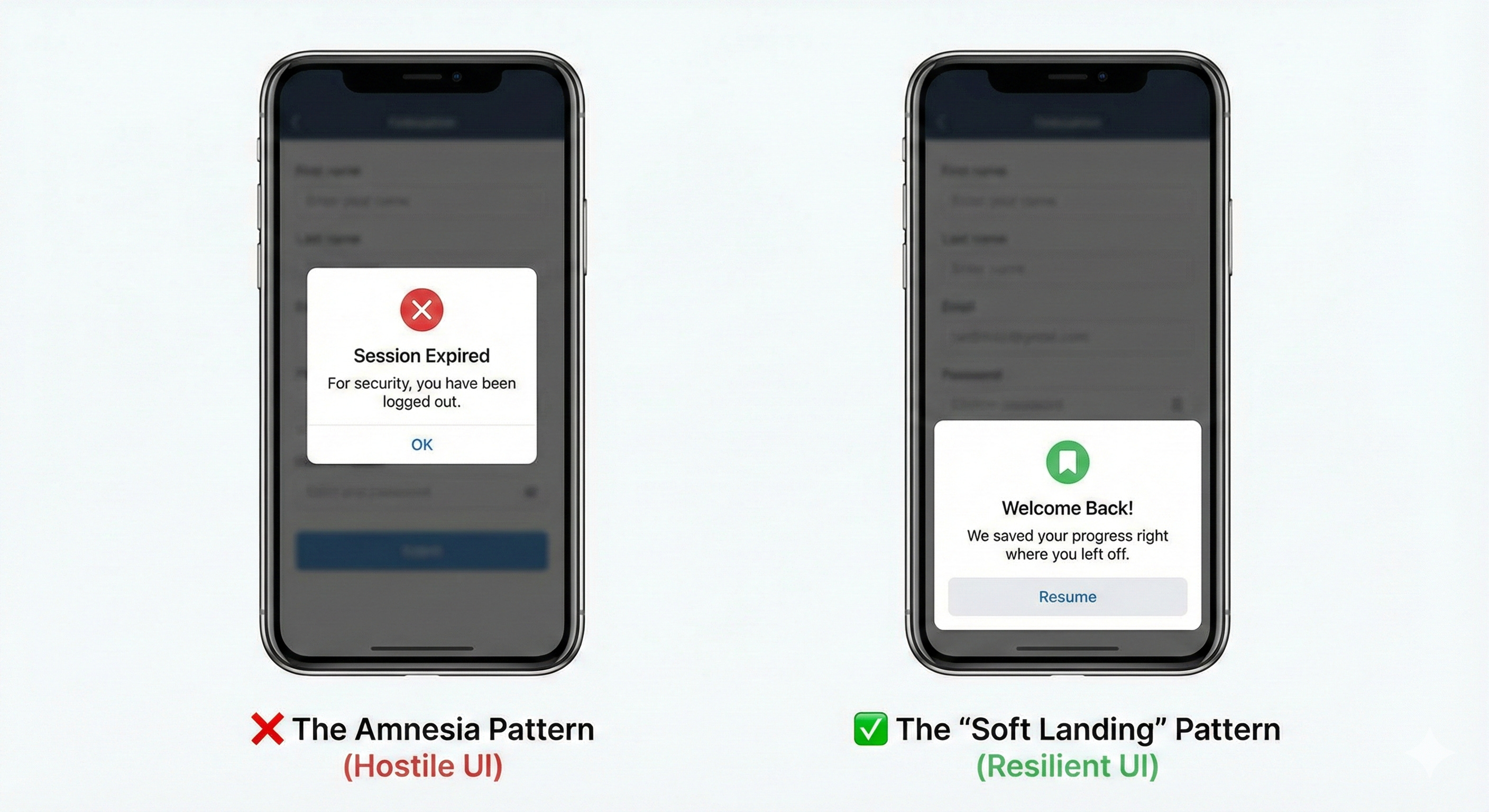
The Concept: Amnesia vs. The Bookmark
The Scenario: A user gets halfway through a complexapplication (insurance, taxes, housing) but gets distracted by real life. They return 20 minutes later.
❌ TheHostile UI
The standard security pattern prioritizes the database over the human. It assumes the user is a security threat,rather than a busy person.
The Experience: A cold modal stating “SessionExpired.” When the user clicks “OK,” they are booted to the login screen. Their data is wiped. They quit.
✅ The Resilient UI
The “Soft Landing” pattern assumes the distraction was involuntary.It offloads the memory burden from the user to the system.
The Experience: A warm modalstating “Welcome back. We saved your progress.” The user enters their password, and the screen restores exactlyto the field they were editing.
Pattern 2: The Critical Error
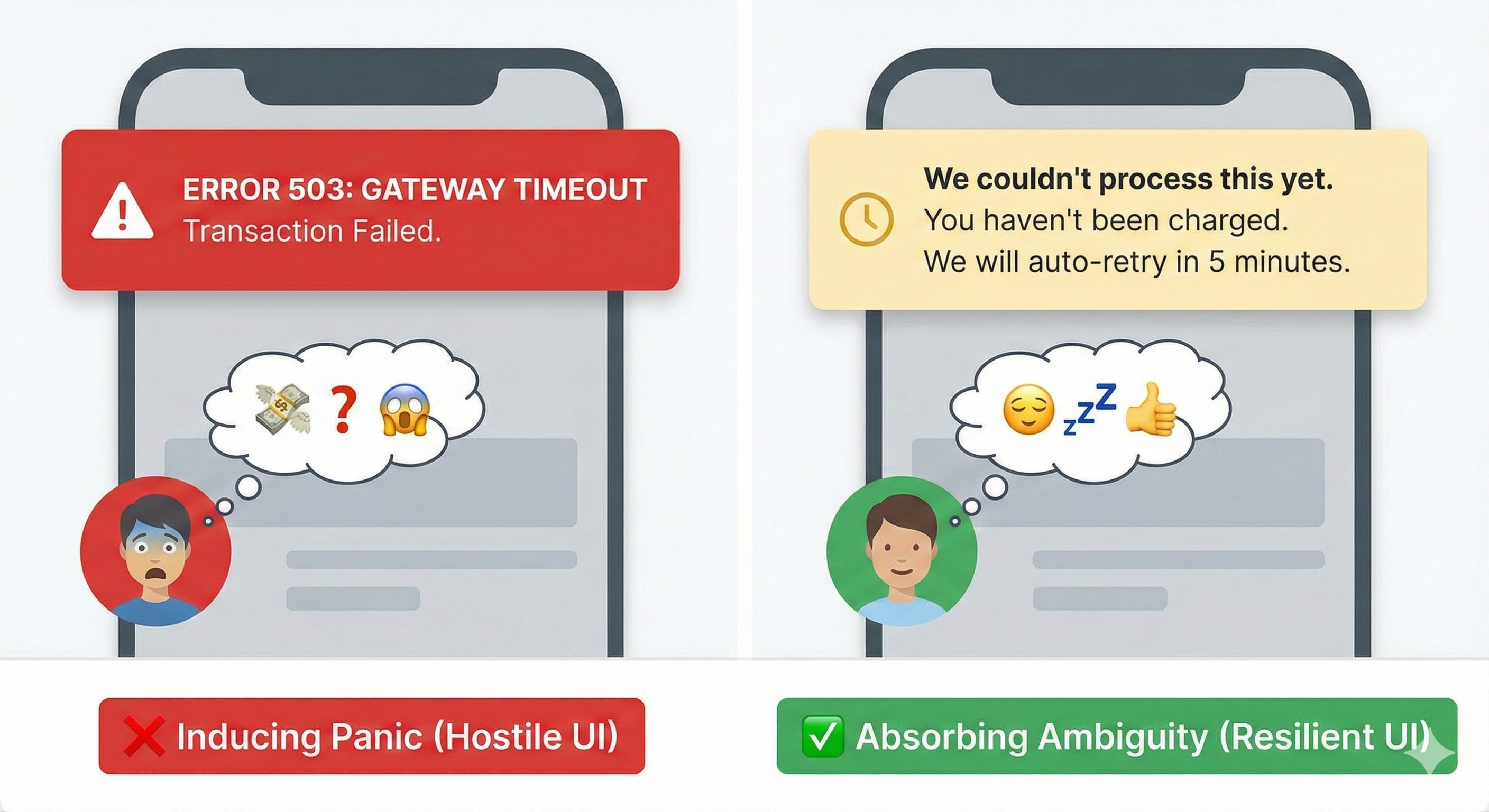
The Concept: Panic vs. Assurance
The Scenario: A payment fails or a sync breaks. The system needsto inform the user that a process has stopped.
❌ The Hostile UI
This pattern pushes the cognitiveload onto the user. It uses “System-Speak” (Error codes, Gateway Timeouts) that induces panic in non-technical users.
The Experience: A red banner reading “Error 503: Gateway Timeout.” The User Thinks: “Did I lose my money? If I click it again, will I be charged twice? I don’t havetime to call support.”
✅ The Resilient UI
This pattern absorbs the ambiguity.It translates the technical failure into a financial status update.
The Experience: Ayellow banner reading “We couldn’t process this yet. Don’t worry, you haven’t been charged. We will auto-retry in 5 minutes.” The User Thinks: “Okay. My money is safe. I can go to sleep.”
Pattern 3: The Destructive Action
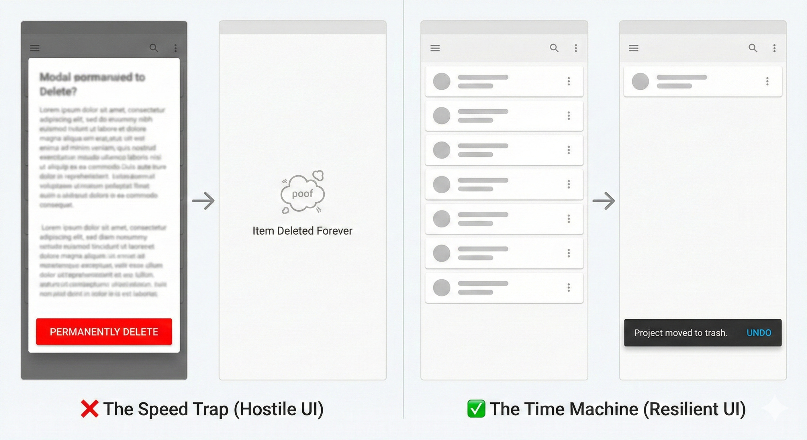
The Concept: Fear vs. Forgiveness
The Scenario: The user hits a button that destroys data (DeleteProject, Cancel Subscription, Remove User).
❌ The Hostile UI
This relies on the user reading fineprint while rushing. It is a “Speed Trap”—it assumes the user is reading, but the user is scanning.
The Experience: A modal asking “Are you sure? This cannot be undone.” The Risk: Sleepy users operate on muscle memory. They see a modal, look for the bright red button, and click it before theirprefrontal cortex registers the warning.
✅ The Resilient UI
This pattern accepts that“Fat Finger” mistakes happen. It replaces fear with time.
The Experience: Theitem disappears immediately, but a toast notification appears: “Project moved to Trash. [Undo]” ThePrinciple: Never demand perfection from a tired person. Always offer a time machine.
Pattern 4:The Login Loop
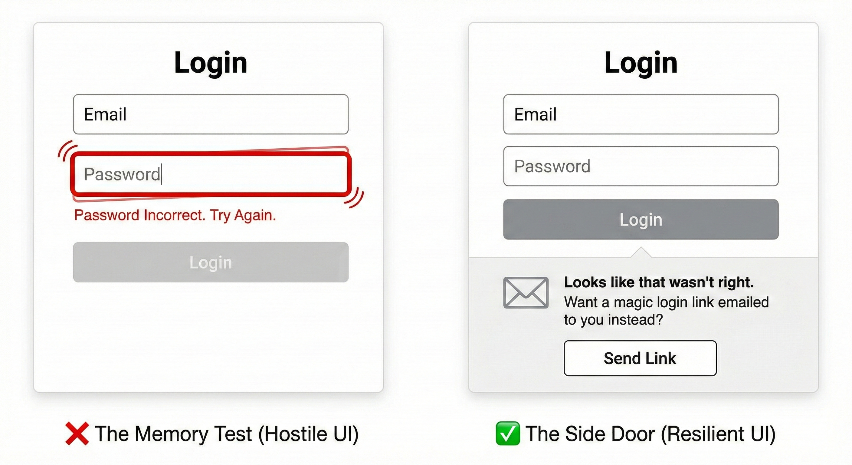
The Concept: The Memory Test vs. The Key
The Scenario: The user is trying to log in on a newdevice but can’t remember their password.
❌ The Hostile UI
The “Memory Test.” Itdemands high-fidelity recall at the exact moment the user is likely frustrated.
The Experience: A shaking text field saying “Password Incorrect. Try Again.” The Result: The user triesthree variations, gets locked out, and churns.
✅ The Resilient UI
The “SideDoor.” If the user fails the primary challenge, the system automatically offers a lower-friction alternative.
The Experience: After one failed attempt, the UI expands: “Looks like that wasn’t right. Wantus to email you a login link instead?” The Principle: Don’t make them bang on the lock. If thefront door is stuck, open the window.
The Designer’s Checklist for Low Energy
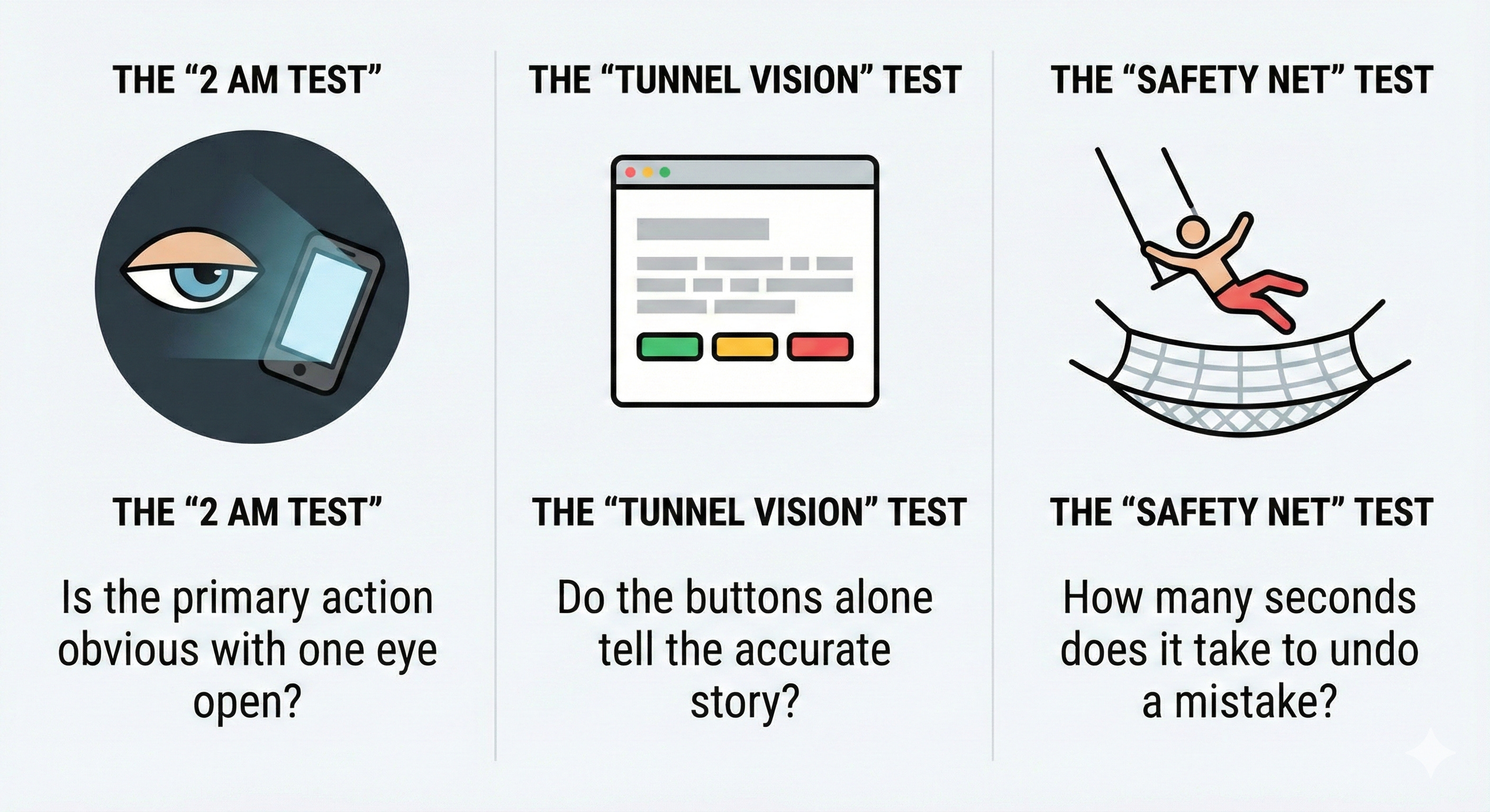
Designing for cognitivescarcity isn't about "dumbing down" the interface. It's about respecting your user's biological reality.
When reviewingyour flows, stress-test them against these three questions:
- The “2 AM Test” If Ilooked at this screen at 2:00 AM with one eye open, is the primary action obvious? Or do I have to read a paragraph to understandwhat to do?
- The “Tunnel Vision” Test Sleepy users ignore grey text. If I removeall the helper text and subheaders, do the buttons alone still tell the accurate story?
- The“Safety Net” Test If I tap the wrong button by accident, how many seconds (and how many clicks) does it take tofix it?
Attention is a finite resource. A respectful UIdoesn’t spend it unless it has to.(note 2)
This is the digital equivalent of the "curb-cut effect." Just as sidewalk ramps originally specifically designed forwheelchair access incidentally improved mobility for parents with strollers, travelers with rolling luggage, and delivery workers,lowering the cognitive bar for the "2 AM user" raises the overall usability ceiling for everyone. An interface easy enough for anexhausted person is effortless for a rested one.
An evolution of Steve Krug’s foundational maxim, "Don’t make me think." While Krug’s philosophyemphasizes clarity to reduce cognitive load for busy users scanning the page, the "Sleepy User" framework emphasizes resilience toaccommodate users whose cognitive capacity is temporarily impaired by biology or circumstance. Krug’s goal is a frictionless"happy path" for a distracted user; the goal here is a safe, recoverable "unhappy path" for an exhausted one.
A cold "SessionExpired" modal is actually perfectly usable according to Krug—it’s clear and tells you what happened.
But itfails the "Sleepy User" test because it lacks empathy for why the user stopped interacting.